In the current era dominated by data, the ability to effectively visualize and interpret this data stands as an invaluable skill. Data visualization is more than just representing numbers visually; it encompasses the art of communicating complex data insights in ways that are accessible and comprehensible to a diverse audience. To ensure clarity and convey meaningful insights, adhering to data visualization best practices is paramount. In this article, we will delve into essential practices that maximize the efficacy of visual data communication.
Read Now : Api Data Structure Best Practices
Importance of Clarity and Simplicity
Clarity and simplicity are the bedrock of effective data visualization best practices. A clear presentation helps the audience to grasp the underlying message without the need for extensive interpretation. Complex datasets, when visualized with simplistic design, avoid overwhelming the viewer with excessive information. It is essential to prioritize the audience’s understanding above all. In practice, this involves selecting appropriate chart types that align with the data’s nature and the insights one wants to highlight. Moreover, simplicity is achieved by minimizing unnecessary embellishments and focusing solely on the core data elements. Adhering to these principles not only enhances comprehension but also reduces cognitive load, making the visualization more impactful.
A crucial aspect is the appropriate use of color schemes and typography that complements the data without overpowering it. Consistent color themes and legible text are vital as they enhance readability and prevent misinterpretation. Furthermore, including clear labels and legends within the visualization ensures that every viewer, irrespective of their familiarity with the data, can understand the representation accurately. These elements collectively contribute to a visualization that is both aesthetically pleasing and informative, embodying data visualization best practices.
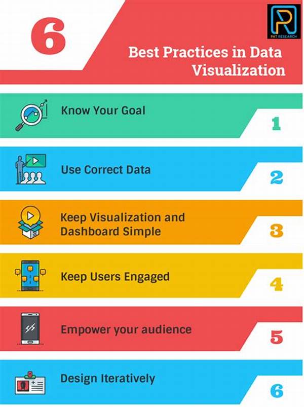
Key Principles for Effective Visualization
1. Data Integrity: Ensuring data accuracy is fundamental. Manipulating or misrepresenting data to create favorable visuals directly contradicts data visualization best practices.
2. Audience Understanding: Tailoring the visualization to the target audience’s level of expertise ensures the message is effectively communicated, adhering to data visualization best practices.
3. Consistent Design: Consistency in design maintains a uniform look and feel, fostering better comprehension and is a hallmark of data visualization best practices.
4. Effective Use of Color: Employing a strategic color palette highlights essential insights without creating distractions, reflecting data visualization best practices.
5. Interactivity: Involving dynamic elements that aid in exploring datasets promotes engagement, aligning with data visualization best practices.
The Role of Context in Data Visualization
Context plays a pivotal role in ensuring data visualization best practices are upheld. The setting in which data is presented can greatly alter its interpretation and subsequent decision-making. It is imperative to provide the viewer with a background or a frame of reference that aids in understanding the displayed data. This involves including supplemental information that adds depth to the visualization, such as annotations or comparative data sets.
Creating an informative context does not mean overwhelming the viewer but rather equipping them with enough information to accurately grasp the significance of the presentation. For instance, when presenting fiscal information over time, it is beneficial to include historical trends or external factors influencing the data. Contextual elements serve as anchors that guide the viewer through the data narrative, ensuring alignment with data visualization best practices and enhancing the overall impact.
Read Now : **influence Of Open-source Communities**
Components of a Successful Data Visualization
Advanced Techniques in Data Visualization
Exploring advanced techniques underscores data visualization best practices by integrating innovative approaches that enhance the utility and appeal of visual representations. Techniques such as advanced interactivity, real-time data integration, and machine learning applications offer new dimensions to data visualization. For instance, interactivity can be employed to allow users to manipulate data visualizations, tailoring insights according to specific interests or queries. This enhances user engagement and fosters a deeper understanding of the data.
Moreover, real-time data integration offers immediacy and relevance to data visualizations, which is crucial in fast-paced environments like financial markets. Implementing machine learning algorithms can provide predictive insights, amplifying the visualization’s value beyond static representations. These approaches must be diligently applied to ensure they remain user-friendly and accessible, adhering to the core principles of data visualization best practices.
Implementing Accessibility in Data Visualization
Accessibility should be an intrinsic component of data visualization best practices. This involves designing visuals that are inclusive and cater to a diverse audience, including those with disabilities. Features like screen reader compatibility, high-contrast color schemes, and text alternatives for visual elements are fundamental in creating accessible data visualizations. By implementing these elements, not only is the audience base broadened, but it also demonstrates a commitment to inclusivity and responsible data practices.
Ultimately, the goal is to ensure that data visualization remains an open and equitable platform for all users, allowing equal access to the insights it provides. In doing so, data visualization best practices can be fully realized, fostering a comprehensive approach to data communication that respects and values diversity.
Conclusion
In conclusion, adhering to data visualization best practices is vital in transforming raw data into actionable insights. Emphasizing clarity, simplicity, and context ensures an audience’s understanding and engagement irrespective of their familiarity with the data presented. As data continues to grow in volume and complexity, effective visualization becomes not just important, but essential in unlocking its potential.
By incorporating practices such as maintaining data integrity, understanding audience needs, and leveraging advanced techniques, we can ensure that data visualizations remain effective and impactful. Ultimately, these best practices guide us in crafting visual narratives that not only communicate information but also inspire and inform decision-making processes in an ever-evolving data-rich landscape.